Sculpting with Metal Clay: Raven Steals the Moon

There is no shortage of templates, texture sheets, or molds in the metal clay world. One can produce beautiful and, sometimes, spectacular, work using these. However, one day in  your metal clay adventure, you will want to move beyond these techniques and into the world of sculpture.

I am going to describe the process I used to sculpt an original bas-relief design in copper clay. The work was inspired by the Tlingit story ‘Raven Steals the Moon’  ( https://en.wikipedia.org/wiki/Raven_Tales). You can, of course, use similar methods to create any bas-relief you like.

To start with, I drew an image of Raven Stealing the Moon (see below). If you can’t draw, that is not a real handicap. Just use a pre-existing image (although use a public domain image, so you don’t violate someone else’s copyright). If  you use a pre-existing image,  you might need to change its size with a copying machine, because (except for shrinkage) your final piece will be the size of your original image. Carefully cut your image out with a craft knife, being sure to not leave any jagged edges on the paper. Make copies of the image, less than the number of layers of your bas-relief (Raven is going to have three layers, so I needed two copies in addition to the original).

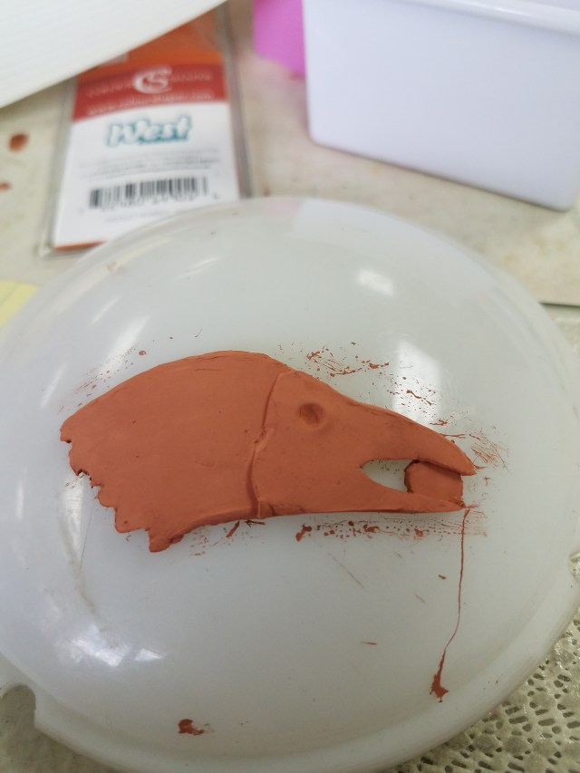
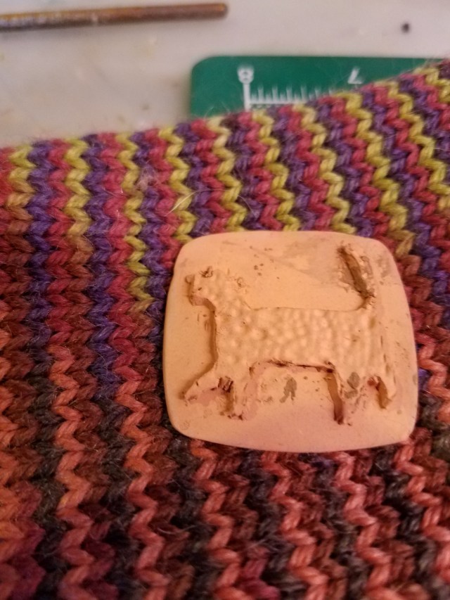
I rolled out the copper clay to 1 mm thick. I cut out the outline of the drawing, using the original drawing as a template. The picture below shows both the original drawing and the outline. The white plastic piece is a dome light, used to the image will not lay flat.

20180217_143053 (002)

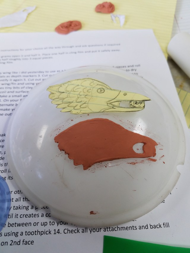
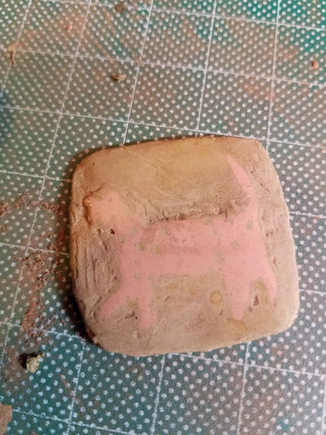
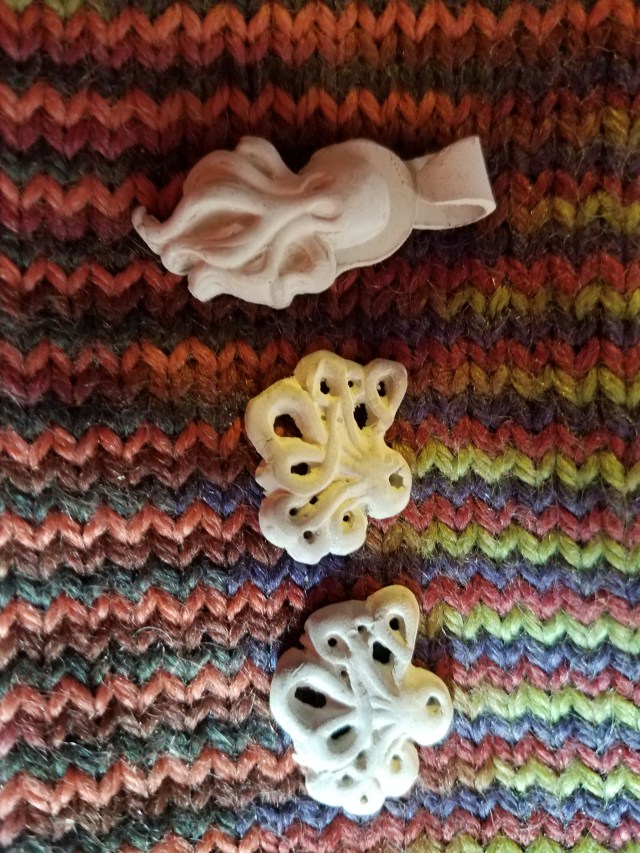
The next step was to cut out a template of the face and beak, 0.75 mm thick. The process was the same, except that I cut away those parts of the copy behind the face. I made an impression where the eye will later go, so there is a place to put the eye. I wanted the moon, in Raven’s beak, to be recessed, so I only included the moon in the first outline.

20180217_145349 (002)

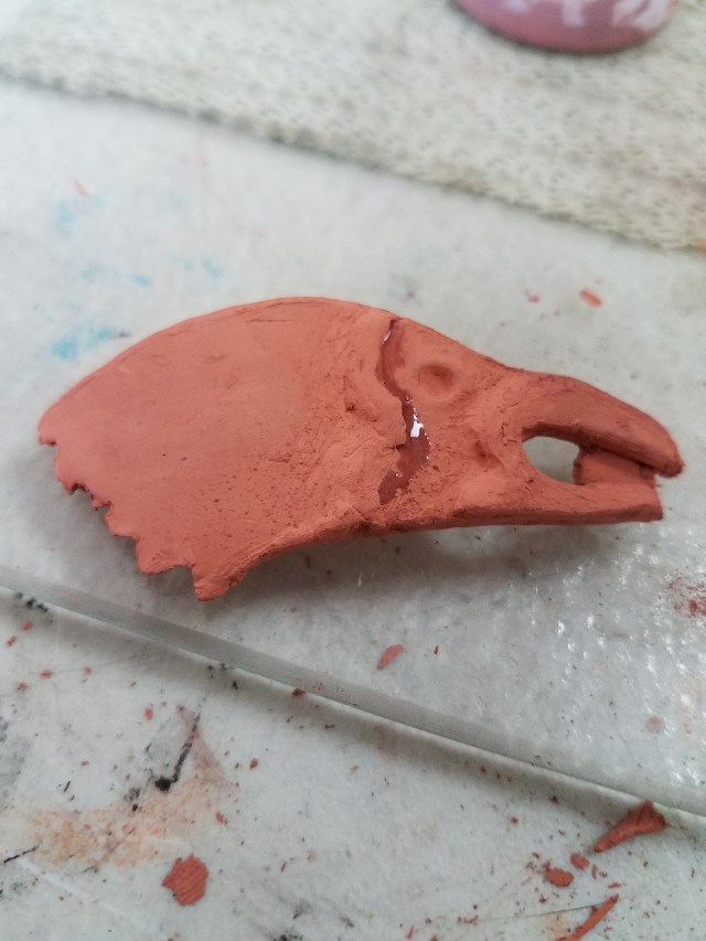
Then I did the same thing with Raven’s beak. There is an abrupt edge between layers. I did not think that looked good, so I beveled the edges and smoothed a bit with a wet sponge.

20180217_164434

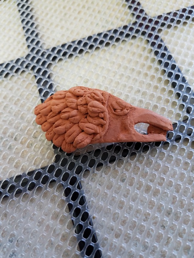
Now to make this look like Raven stealing the moon.

Add an eye. Make a tiny sphere of metal clay. Dampen the eye socket and insert the sphere. Roll out three very small snakes of clay. Flatten all three along the edge. Place one atop the eye socket for an eyelid, holding the eyeball in place. Place the second below the eye socket, forming the lower eyelid. Then place the third one atop the upper eyelid (birds have an extra eyelid —  you would stop at two if you were making an image of a mammal).

Add feathers. I wanted the feathers to be fairly rough, since ravens tend to ruffle the feathers on the back of their necks when excited. To do this, I made a tiny teardrop of clay. I flattened it and drew a shaft for the feather with a cutting tool. This is one feather.  Applying slip, I applied the feather to the back of the raven’s neck. I repeated this process until I had a row of feathers. Then, working from the back forward, I covered the piece with feathers up to the neck. Yes, this is a time consuming process, but the results are worth it. When all the feathers were done, I covered them with a thin layer of slip to smooth them out.

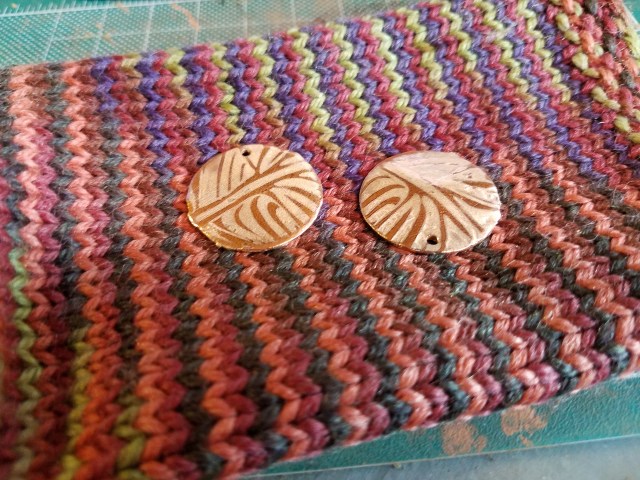
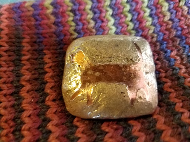
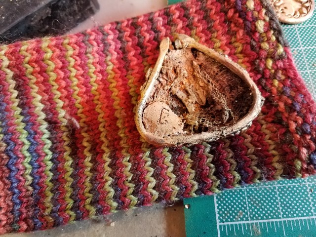
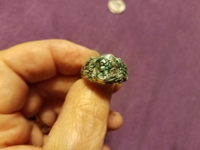
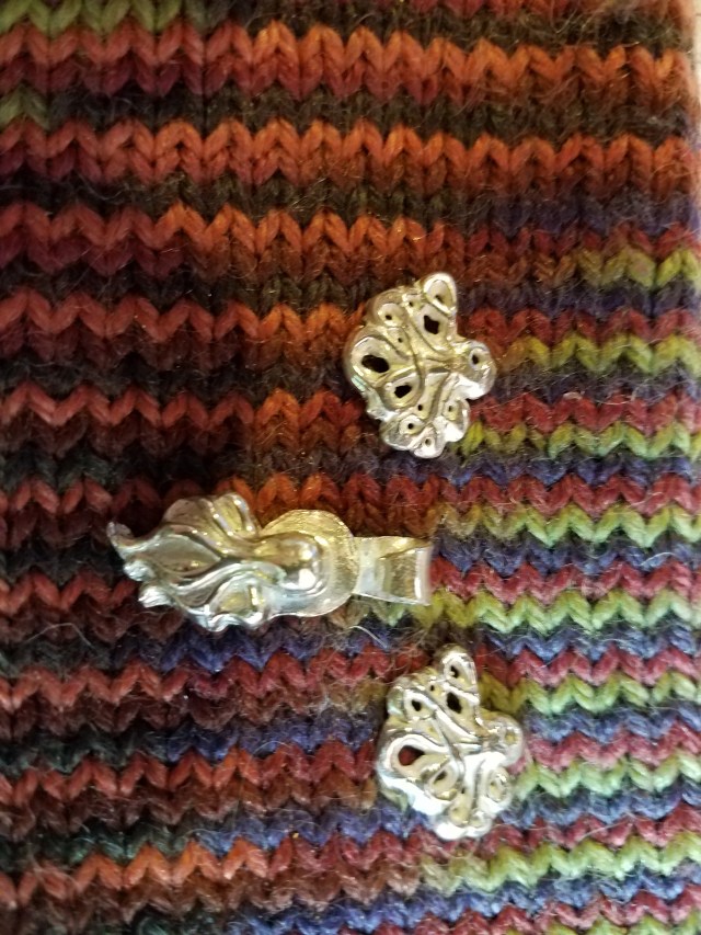
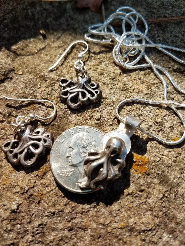
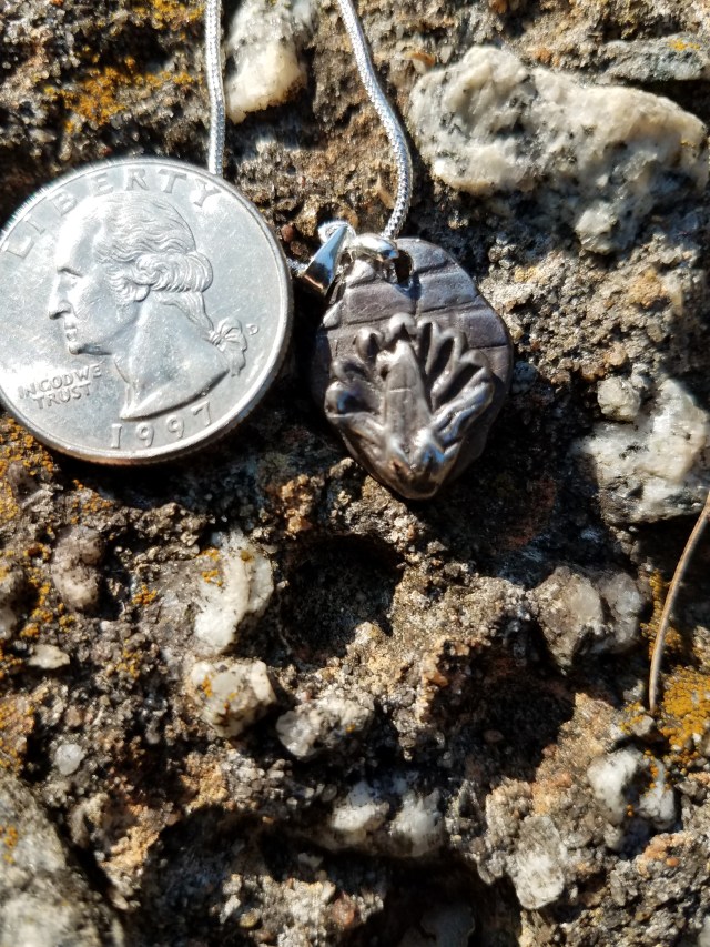
The result appears below.

20180218_131807

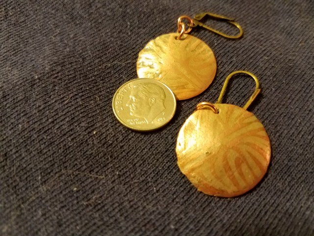
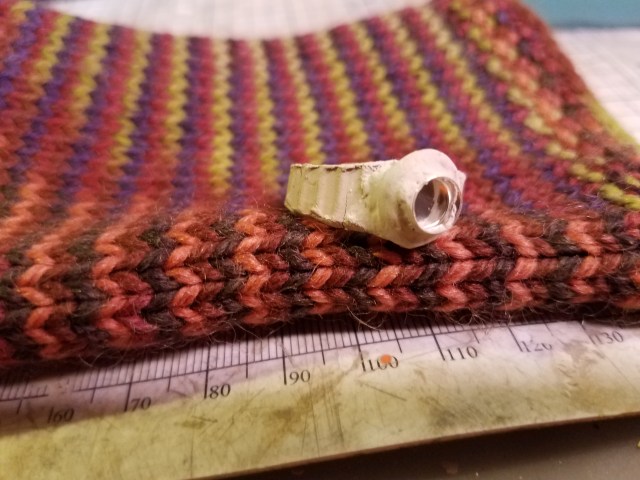
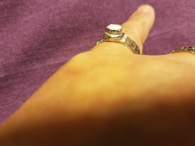
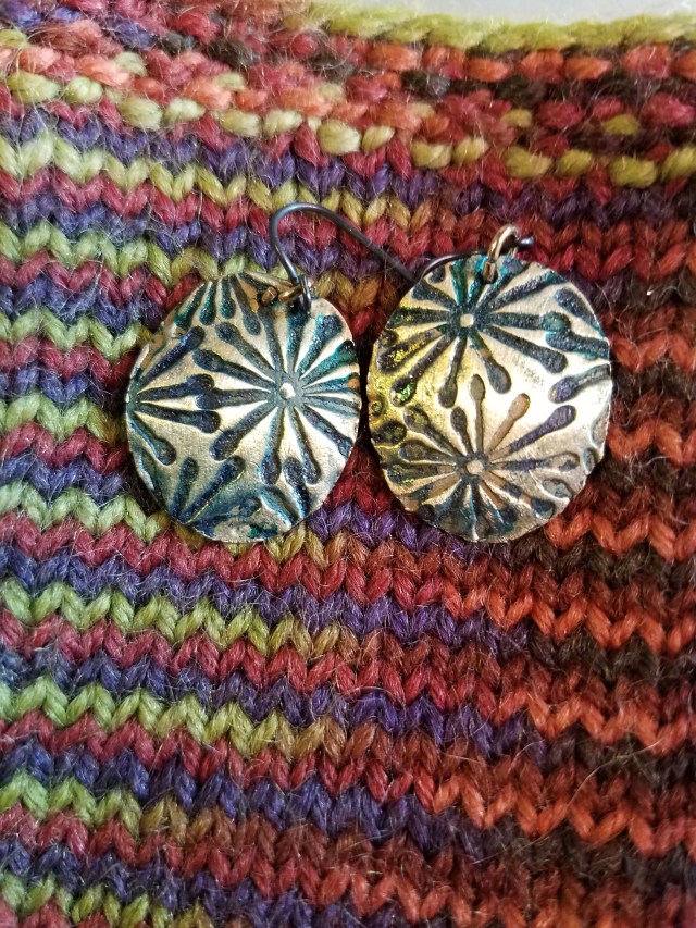
I attached an invisible bail to the back. The piece has yet to be fired. When it is fired, tumbled, and patinaed, I will show it to you. That will probably be my next post.

In closing, I would like to encourage you to try sculpting. It isn’t has hard as it looks. With a little practice, you can produce truly one-of-a-kind pieces.

Mixed metals: Two pairs of earrings

Continuing in the theme of mixing copper and bronze clay, I will describe two pairs of mixed metal earrings (vines and butterflies). Since the technique is similar to the cat in the last posting, I won’t go into as much detail about technique. However, I will discuss the magic of patina — and how one should embrace the unpredictability of patinas.

Vines. First, I rolled out copper clay to a thickness of 0.75mm and textured it with a vine-like design.

20171216_103618

This could have been the basis of a satisfactory pair of earrings, but I continued working. I used the thick paste of bronze clay to cover the design. Making sure that the holes for the jump rings were preserved, I sanded the bronze away, until the copper shows through the raised places in the design and the bronze filled the depressions in the design.

20171217_093425

Note that the difference between the copper and bronze is somewhat subtle. This is nothing to be alarmed about, it will be fixed later.

The pieces were fired (using the same method as described in the posting about the Roman cat) and tumbled.

20171231_105755

It might have been nice to preserve them at this stage. However, copper will discolor from air and handling, so it is best to patina the copper so you have some input into what the piece will eventually look like. Like the cat in the previous posting, I used Baldwin’s patina. Usually, Baldwin’s patina turns copper a lustrous brown and has relatively little impact on bronze. This time, it didn’t work that way. That’s part of the charm of patina — you never know what you are going to get until it happens. This time, the bronze became a bit less reflective and the copper turned a lovely blue-green. The photograph makes the copper look a bit browner than it actually is, but that’s the way things work.  The coin is for scale.

20171231_135435

Like the cat, I sprayed the earrings with a fixative to prevent further discoloration of the metal. The earrings were done!

Butterflies:   I made a pair of butterfly shaped copper earrings, textured with wood grain. I made bodies for the butterflies.

20171217_104611

Again, I covered the wings with bronze clay (leaving the body) and then sanded the bronze down. I fired using the same schedule I used for the Roman cat, and then tumbled.

20171231_105744

I used the same batch of Baldwin’s patina on the butterflies that I used on the vine earrings. Again, the coin is for scale.

20171231_135510

The butterflies resulted in a lovely wood-grain look. I intend to exploit the wood-grain look in later pieces. As you can see, the butterfly bodies are much more blue-green than the wings. That’s the way patinas are — when you patina your work, be prepared for a surprise! If you don’t like what you get, you can use heat to remove the patina and patina all over. Maybe the patina gods will be kinder next time 😉


Combining Copper and Bronze: Roman Cat Pendant

I have not posted in a while due to a bout of influenza. However, while ill, I was still working on jewelry (albeit at a glacial pace). I became intrigued with the concept of combining bronze and copper to make a single smooth piece that looks as though one metal is embedded in the other.  Over the past few weeks, I made several pieces, each with its own challenges and rewards. I am going to describe the three pieces, and how they turned out, in separates posts. The three pieces are: Roman cat pendant; butterfly earrings; and abstract earrings.

Roman Cat Pendant: While making a piece that had the look of Imperial Rome was, admittedly, not my design, that’s how the piece turned out. That’s one of the joys of metal clay — often you get happy accidents, when things you had never expected emerge from  your work.

The first step was to deeply texture a piece of Art Clay brand copper clay, and then to cut a cat shaped piece of it out. I made a flat copper clay background, and attached the cat as follows.

20171216_103614

The cat is not very refined. It does not need to be. The next step is to take some Fast Fire Bronz clay, and mix it with water until it becomes a paste (Art Clay copper and Fast Fire Bronz some close to having the same shrinkage, and therefore you don’t wind up causing your work to lose its shape while it is firing) . I then covered the cat and the background with the paste. I waited until the paste had dried. After drying, I started sanding. By carefully sanding away the bronze, I wound up with the copper cat showing through (with some of the texture in the cat filled with bronze) and a bronze background. Ideally, the bronze background should be smooth. This turned out to be a nightmarish process — it took a great deal of sanding to approximate smoothness (and losing some of the texture on the cat in the process). Then, when I thought I was done, I discovered some indentations in the bronze. I filled them in with more bronze paste, let it dry, and sanded again. This process was repeated until I achieved an approximation of my original goal.

20171223_110558

Just for clarification: this photo was taken part-way through the process. There are several ‘dings’ that had to be filled in with bronze paste before it was ready to fire. Finally, it was ready to fire. But bronze and copper fire at different temperatures! Fortunately, there is a solution. I fired the piece (in activated coconut charcoal) at the temperature at which Fast Fire Bronz works in my kiln (for me, that’s 1425 degrees F — your kiln might fire either hotter or cooler than it says it does, so you will have to fire test pieces to see what works for you).  Art Clay copper will sinter at this temperature in 3.5 hours. After this long firing  (and, after cooling, tumbling), the piece was ready!

20171231_105731

The copper cat shows through, as intended. The bronze background contrasts to it. Some bronze appears on the cat, as intended — both to produce a spotted cat and to have a bit more visual interest than a solid piece of copper. While new copper is pretty, it won’t last. Copper is very reactive and will discolor from both handling and exposure to atmospheric oxygen. To patina it, I chose Bladwin’s patina. Baldwin’s patina reacts with copper, but very little with bronze. Thus, the copper will change color a lot while the bronze will change color a little.

Here is the finished piece, with a chain and a coin for scale.

20171231_135255

While I did not intend it to be so, it looks like it came out of Pompei!  Always be ready for a happy accident while working with metal clay!

In the next post, I will describe the happy accidents for the butterfly earrings and the abstract earrings.


An Invisible Bail that Won’t Flip

I haven’t posted anything for a while because I have been dealing with commissions. However, so as to not get too far behind, I thought I would do a short post.

Invisible bails are bails on the backs of pendants, so they cannot be seen when being worn. However, they can have drawbacks. If they are not just the right width, a pendant can flip so the obverse shows instead of the face. If they are too high, they can be seen from certain angles, defeating the purpose of an invisible bail. If they are too low, they can flip from top to bottom.

While working on a holiday pendant, a solution occurred to me. This is so simple that I can’t be the first person to think of it. However, I do not recall seeing it before.

Just so there is some context, the face of the pendant (a bronze design with a holiday tree on it) appears below.

20171202_141649
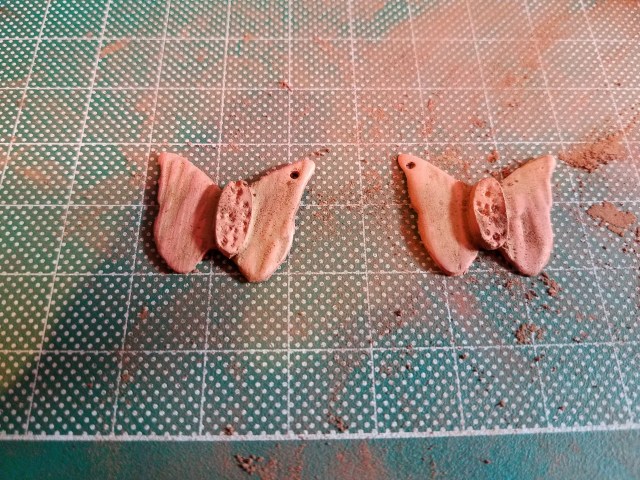
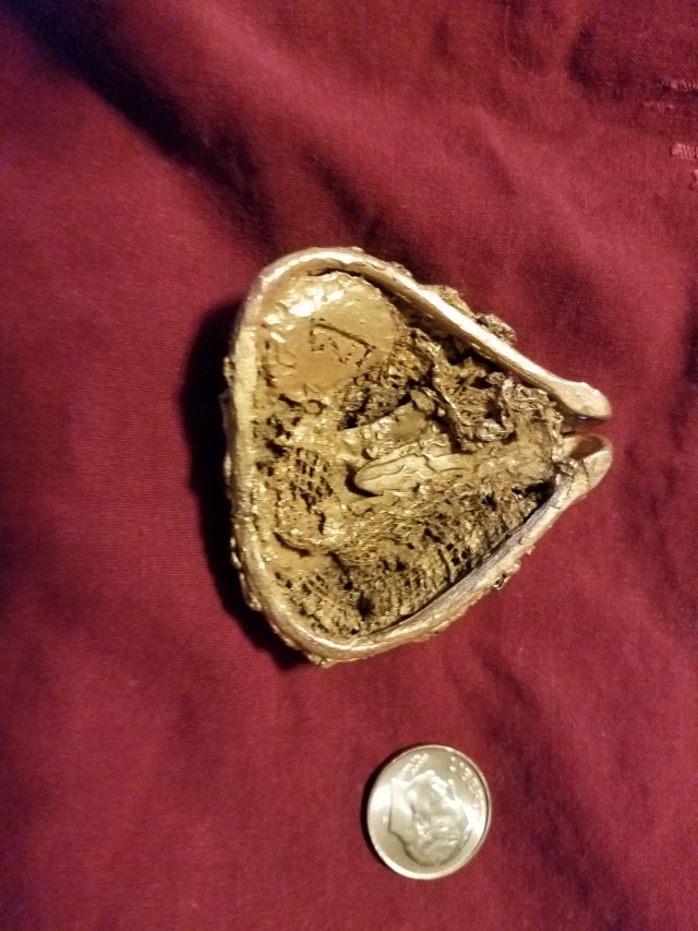
Now for the other side.

20171202_141653

The three point anchor means the pendant will not flip, either from side to side or from bottom to top. Because there are three points holding it in place, the chain looks natural when it is worn (I tried it with two points, and the chain does not look right).

If you haven’t already run into this on  your own, it is a way to make pendants with invisible bails that hang naturally and do not flip. I hope this is of benefit to you in your jewelry adventures.

Metal Clay and Organic Textures

Metal clay and organic textures – they sound pretty far removed, don’t they? Here, we are going to discuss a method for including organic textures in a pendant. I used bronze, but silver would be quite effective.

So we know where we are going, the finished piece appears below (with a coin for scale):

20171104_152548

U have not yet decided what kind of chain it needs, but you don’t need to see the chain to get the idea.

I’m going to start with an apology. My camera malfunctioned, and I had not saved a backup copy of the pictures. Thus, I have no photos for the first steps in the process.

I started with wood clay (https://pmcconnection.com/metal-clay/wood-clay/wood-clay.html). To make a base for the work, I chose a ‘fat triangle’ template. I rolled the wood clay to a thickness of 3 mm. I then covered it with a smooth sheet of plastic wrap, put the template atop the plastic wrap, and pushed down with my thumbs around the edge of the template. This gives a natural, rounded shape without too much sanding. I let this dry, and then sanded off any imperfections – primarily ‘phlanges’ left around the edge (pressing with thumbs leaves a thin layer, but it still leaves some).

After this had dried, I used a syringe to extrude a long ‘snake’ of FastFire Bronz (https://pmcconnection.com/fastfire-bronzclay-100g.html). I wrapped the ‘snake’ tightly around the edges of wooden form, making a frame on which to attach metal clay. I chose to use the snake to make a bail for the pendant.

When this had dried, I used a mold to make a focal piece for the pendant (you will see it when I get to pictures). After that dried, I cut some long strips of cheesecloth. While silver dust will adhere to the cheesecloth, I had little success with bronze. Therefore, to get the clay onto the cheesecloth, I made a very watery paste of the clay, spread the cheesecloth out as widely as possible, and then painted it on. I let it dry and, where necessary, applied a second coat.

I then applied the bronze coated cheesecloth to the frame, making sure it did not cover the focal piece. I attached the cheesecloth to the frame with bronze clay paste, making sure it also adhered to the focal piece. This was an iterative process, applying more cheesecloth where I thought it necessary. The greenware, with the dried wood clay inside it, looked like this:

20171026_155944


I fired it in coconut charcoal, with a ramp speed of 1000 degrees F, to a temperature of 1525 degrees F (caveat: your kiln might fire a bit hotter or colder than it says it does, so be sure to adjust accordingly). Silver clay, of course, does not require charcoal. With silver clay, the wood burns away, there is a great deal of smoke, and firing needs to be done in a well ventilated area. With the charcoal for the bronze clay, there was little (if any, I didn’t see any) smoke. Instead of the wood burning away, it charred into what amounts to a charcoal briquette. I was able to pry this out without too much difficulty after the piece had fired and cooled.

After the piece cooled, it felt strong. That is, I don’t think it needed reinforcement for purposes of holding together. However, I wanted to add some interest to the back, so I added more cheesecloth and fired again. The back before firing appears below. The odd marking on the bottom left is the maker’s mark for my jewelry studio.

20171102_154808

20171102_154801

Even after firing, there were still some issues. For one thing, there were some sharp protrusions around the edges, places where I had not done a stellar job of joining the cheesecloth and frame evenly. These were surprisingly easy to remove by steadying the piece against a rubber block and filing away the undesired edges. The other problem was that the cheesecloth felt a bit ‘prickly’. I tumbled the piece for two hours. I noticed that the ‘prickles’ were much less prominent. I put the piece back in the tumbler and tumbled for another four hours. After that, the ‘prickles’ were gone, solving the problem.

After that, the piece was effectively finished. I made the choice to not patina it. Since it has the ‘organic’ look, I decided to let nature take its course and let the piece develop whatever patina it would.

You have already seen the finished front. The finished back appears below.

20171104_152554

I hope you will try this technique. Just be sure to remember, if you use silver, to vent your kiln, open a window or door, and run a fan directed outward. While bronze produces little to no smoke, because of the charcoal, open shelf fired silver produces a great deal of smoke.

Rethinking Rings

There are many things you can do with metal clay and rings. Today, I am going to talk about two ring-making topics: making rings from molds and repairing cracks that appear when your ring is in the kiln.

I have posted on ring-making before. Usually, I treat a ring like any other metal clay product. However, rings can be made from molds.

20171003_162843

You can treat this like any other mold — lubricate the mold so that the metal clay will not stick, roll out your metal clay to the desired thickness, force the clay into the mold, and then scrape the excess clay off the top so the back of your piece is smooth. Then, remove it from the mold. The wet clay can then be treated like any other ring; place it on a mandrel of the appropriate size (being sure to allow for shrinkage) to dry. My experience is that bronze and fine silver shrink two sizes, and sterling shrinks 1.5 sizes. For this ring, I used sterling.

The ring, in greenware, looked like this:

20171003_162917

I finished it like any other metal clay, fired, and tumbled it. I then applied a bit of patina to the cameo, so the face and decoration around the face would be obvious. I left the rest shiny.  Then I decided that the regular patina did not show the face clearly enough. I then added a drop of alcohol ink, then rubbed off the excess. The result was:

20171008_151148

The second topic is what to do when a ring cracks during firing. The greenware I was working with was:

20171003_162929

It is a pretty standard ring, with a textured band and a bezel cup intended to hold a stone. It was made of sterling clay. So far, so good. However, when I fired it, there was a large crack in the banc. (My apologies for not having a photo of the cracked band.) Did that mean that the piece goes into recycling? Certainly not!

As you probably know, the white color that comes out of the kiln is made up of tiny pieces of silver sticking up. This is important, as you will see in the next paragraph.

I made up a bit of paste with fine silver clay. Before brushing (so the clay would be able to adhere to the tiny pieces sticking up), I applied the paste to the crack. I filled the crack and put a thin layer around its outside. I made the layer very thin, so it did not change the size of the ring. Then, after drying, I refired. The fine silver adhered, fixing the crack.  I could have used sterling, but fine silver is much easier to fire, no one will be able to tell the difference in such a small area, and I was in a hurry.  The bottom line is that the crack had been repaired, in such a way that no one could tell the difference.

I brushed, tumbled, and patinaed the ring. Then I fitted the bezel cup with a white opal. The result:

20171008_151352

Don’t be afraid to try molded rings, and don’t be afraid to fix a ring if it cracks while firing! And most of all, keep being creative with metal clay!


Original PMC — Some Retro Metal Clay

The original PMC silver was one of (maybe the) first commercially available metal clays.  It isn’t being made anymore, for a variety of reasons. For one thing, it took two hours at 1650 degrees for it to sinter. For another, the final product was quite soft — too soft for, for example, a ring or a cuff.

That is not to say that PMC did not have its charms. One was that it shrank about 25%. On first glance, a lot of shrinking might sound bad. However, it gives you the ability to produce some incredibly fine detail in your work. A fine texture, when applied to the wet clay, produces something that is utterly amazing when it winds up fired.

I recently found an envelope of the original PMC silver. While I probably won’t find any more, I thought I would share what I did. After all,  you might come on some original PMC. If you do, there are lots of things you can do with it.

The first thing I made was a commission. A client wanted an octopus pendant and earring set. The pendant would not be a problem — just make an octopus. The earrings were a challenge. If I made them two dimensional, they just didn’t look right. If I made them three dimensional, they would be too heavy. Original PMC to the rescue! I could make a pair of three dimensional octopus earrings with Original PMC, then they would shrink enough to not be too heavy to wear.

First, I found a mold that had two octopus designs on it. In one design, the octopus had dangling tentacles. In the other, they were wrapped around the body. Attaching a circle to the back of the pendant to fasten the bail to, I made earrings and pendant. The greenware is below.

20170915_191745

I fired at the required temperature for the required time and tumbled. The pieces that came out of the tumbler looked like this:

20170922_092039

Finally, I applied a patina and attached findings. I chose to leave the circle behind the dangling octopus’ head shiny, for contrast. The coin is for scale, showing how small these pieces are.

20170922_100033

Now, I had just a little original PMC left over. If I didn’t use it, it would dry out. I decided to make an Egyptian themed piece.

I had a mold of an Egyptian lotus blossom. Carrying the theme of ancient construction, I made a background that looked like stonework. The greenware is below.

20170915_191726

After firing and tumbling, it looked like this:

20170922_092100

After applying a patina and attaching chain and pinch bail, I wound up with this:

20170922_095949

While I am glad we have more modern forms of metal clay, I kind of miss the original. It let you do extremely fine work. Also, it was quite good for carving.

Should you happen to find some original PMC silver, I hope you will explore how its limitations can be used as an artistic statement.

Product Review: Art Clay 950

Fine silver is great. It doesn’t tarnish. It is, in metal clay form, easy to work with. However, it is also fairly soft. While a fine silver ring is good for a ring that is to be worn occasionally, there are problems with wearing it every day. It will probably slip out of being truly round (easy to fix if you are wearing it yourself, not so much if you have sold it to a customer).  Even worse, it can, after lots of wear, acquire dings or scratches. The solution? Sterling.

Sterling silver is a silver/copper alloy. It is about 60% harder than fine silver. While it will tarnish, removing tarnish isn’t hard. In fact, if you own any sterling silver eating utensils, you have probably had to deal with tarnish.

There are several ways of approaching sterling with metal clay. There are sterling clays. However, most require firing in carbon. If you are used to working with base metals, this is not an issue. However, many people prefer the simplicity of fine silver’s open shelf firing. One can create a 50/50 mix of sterling clay and fine silver clay. This approach allows you to open-shelf fire. However, (1) some people find mixing a hassle and (2) this produces an alloy that is close to but not quite sterling, and therefore could introduce legal issues if you sell your work.

Art Clay 950 clay addresses these issues. This clay come premixed. It can be open shelf fired, and therefore avoids carbon firing for those who prefer avoiding carbon.

Art Clay 950 has a texture and feel very similar to Art Clay fine silver. Thus, if you are used to Art Clay fine silver, you will feel comfortable with Art Clay 950. It is not sticky, and has a good working time.

My endorsement is not 100% positive. There were two minor drawbacks. First of all, the firing is two stage. The first firing burns off the binder and the second sinters the clay. This is a minor issue for those used to two-stage clays, like many bronzes are. However, for someone used to working with silver clay only, it could be an issue. The second is that it did not shrink quite as much as Art Clay silver. I used it to make three rings (illustrations below), sized the same as I would have with Art Clay fine silver. The three rings all wound up about a half size larger than I expected. This is a minor issue, because now I know to make future rings a half size smaller. Still, it was somewhat annoying to produce three rings that didn’t quite fit.

The products I used Art Clay 950 for:

20170904_132302

20170904_132317

The dark blue stone is lapis and the purple stone is tanzanite. These were set with bezel cups. The orange stone is a CZ that I fired directly in the clay.

Overall, I was happy with Art Clay 950. It’s just that, the next time I use it, I will be aware of how much shrinkage to expect.

Alcohol Ink: Adding Color to Bronze

Do you love the way that patinas can turn silver blue, purple, golden, and even red? I know I do. However, I also like working with bronze. The usual patinas only turn bronze black. Baldwin’s patina, while it can install a lovely color on copper, doesn’t do much to bronze. This post describes an experiment in adding color to bronze jewelry through alcohol ink.

First, I made two pairs of straightforward bronze earrings. Figuring that the depth of the texture would have an impact, I gave one pair a very deep texture and the other a shallow texture. After finishing, firing, and tumbling, I was ready to experiment with color.

I had two bottles of alcohol ink, one blue and the other green. Finding the pure hues a bit less complex than what I wanted, I mixed them to yield a blue-green ink. Then, using an old, disposable, paint brush, I painted the earrings.

If one merely dabs the color on, the effect is underwhelming. To get the effect you want, you need to thoroughly coat the metal. In fact, I coated it so heavily that the texture almost vanished. I let the ink dry to the point that it was no longer tacky, but not truly try either. Then, using a nail filing sponge, I scraped off the ink. The result was that the ink remained in the depressions but came off the raised places, much like regular patina. The results appear below.

20170826_153052

20170826_153037

In the deeper texture (the stars/flowers/however you see them), the ink looked almost black. In fact, to notice the color, you needed the light to hit them just right. In the shallow texture, the color was quite apparent.

After doing this, I realized another benefit of alcohol ink. Most patinas, even when wiped off, darken the bronze. Alcohol ink did not. Thus, the non-colored part of the earrings were extremely shiny. This broadens one’s options — a way to simultaneously patina bronze and leave it shiny.

While I only used blue and green, alcohol ink comes in a wide variety of colors. If you are interested in coloring your bronze pieces, consider giving alcohol inks a try.

The John C Campbell Folk School: a Resource for Learning

I’m going a bit off topic in the post. The John C Campbell Folk School (folkschool.org), in Brasstown, North Carolina, is a great way to learn new arts or to polish the ones your already know. It follows the Danish folk school model (non competitive, no grades, learning for the sake of learning). It teaches week and weekend long classes, in a variety of arts (including, of course, metal clay). One can choose to stay in the school’s housing or stay off campus. While the latter option is slightly less expensive, staying on campus frees you from the need to drive, thus letting you focus on learning. In addition, the instructors recruited for the John C Campbell Folk School tend to be top notch (for example, Pam East teaches most of the metal clay classes).

I went there last week to take a class in drawing from nature. Previous to this, I had almost zero experience in drawing. I want to present a few of the pieces I was able to create in five days of classes, with almost no experience. I provide this information, so you can see how far one can go with one of these classes.

20170817_150302
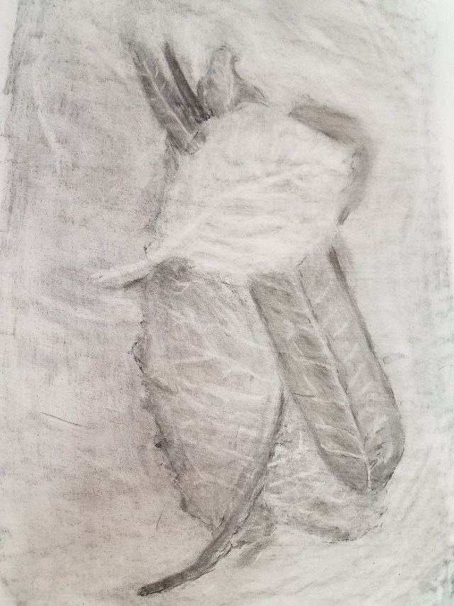
This is the first time I ever tried to do anything with charcoal. Charcoal is, in many ways, the opposite of traditional drawing — one darkens the entire page with charcoal, and then erases to lighten the places where you want the image to be.

20170817_150221
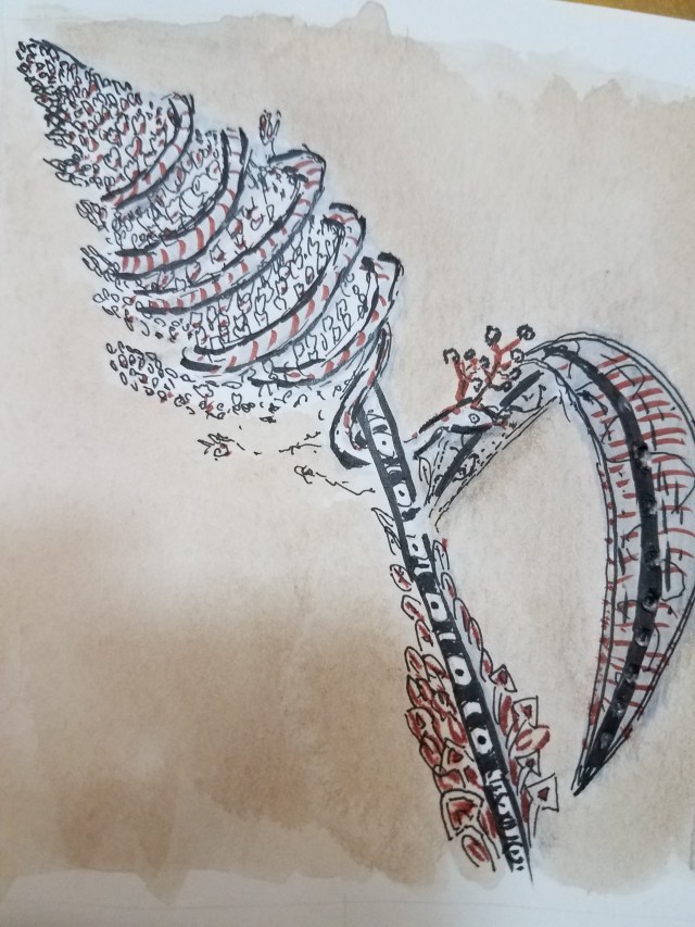
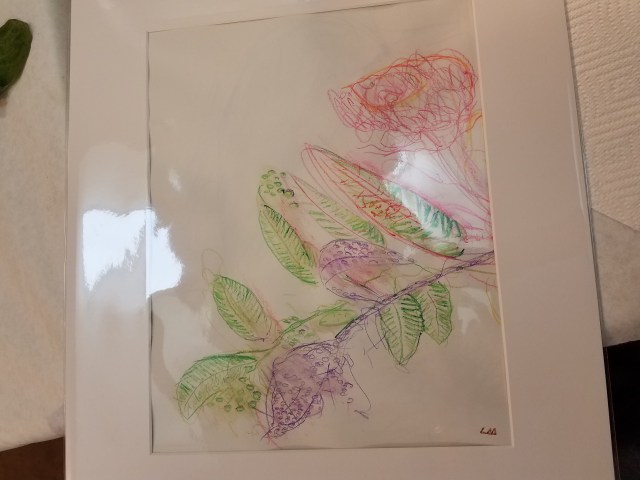
This is literally an exercise — although the instructor liked it so well that she had me matt it. I was told to select nine different colored pencils and then shown a vase containing various plants. The instructions were to spend ten seconds drawing with each color. Then, after that was done, the students were allows to have 90 seconds to clean up their work. If you see fewer than nine colors (and you do), it is because the others were eliminated in the matting.

20170815_163558

This is a pen and ink fanciful drawing of a spray of Bloody Butcher, a broom-corn like plant.

The illustration below is a colored pencil illustration of a vine. To give the vine some character, I let it thread through a piece of cloth.

20170817_153656

My final example is my favorite — a foliate mask done with a combination of conte de Paris and colored pencil. Conte de Paris are a type of crayon for adults that limit the color choices to four (black, brown, terra cotta, and white). Using a combination of blending and force on the crayon, one can produce different degrees of darkness of illustration, thereby producing a more complex picture than four colors would suggest.

20170817_150146

I strongly recommend the John C Campbell Folk School as a resource. What you can learn in a week (or even a weekend) is nothing short of amazing.